How to Decorate Your Entire Home With Timeless Neutral Colors and Tones

Choosing a neutral palette to define your interior scheme doesn’t mean the look should be boring or bland. In fact, the latest neutrals are about delivering layers and complexity. Luckily, we have some easy tips to decorate with neutral colors that are both exciting and timeless!
Interior designer Shaynna Blaze says neutrals are equally capable of bringing edge and sophistication as warmth and comfort, pointing to Taubmans Windy Beach as the perfect example. “It’s a color that makes a traditional room feel modern and a minimal contemporary space feel less stark,” she explains.
This versatility is what is making “the new neutrals” the go-to palette for interior designers, cementing their place in homes for the next decade. Look out for a host of new gray-based shades, hints of green, and even gentle mauves, adding to some tried-and-true classics. Here, we remove the guesswork by sharing the experts’ hand-selected neutral schemes.
Look 1: Complex
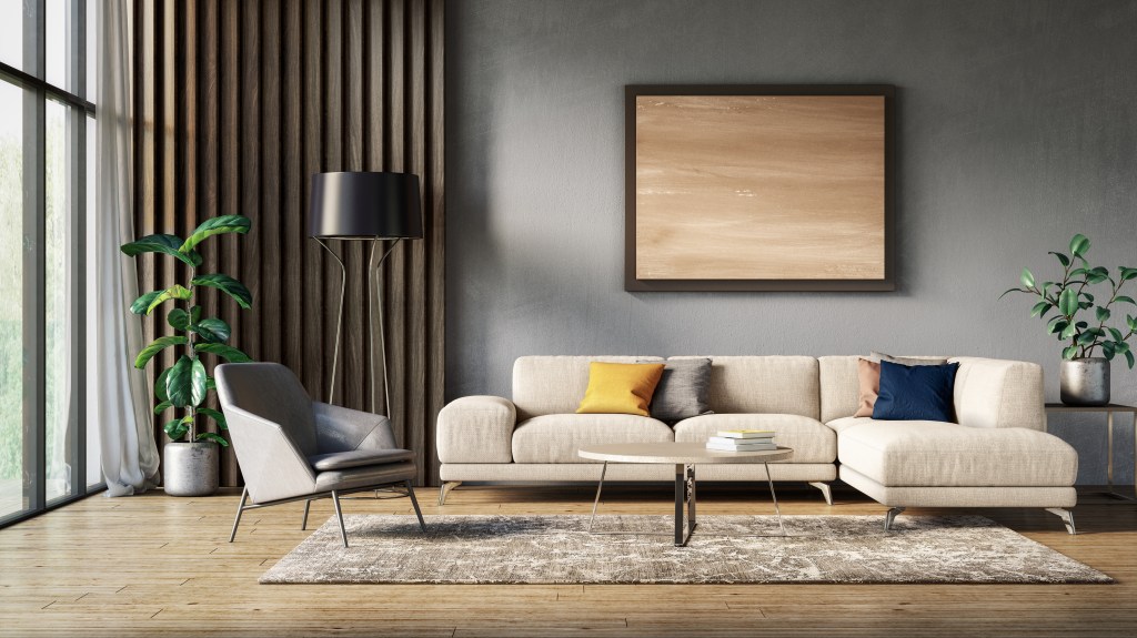
“Try using Woodsmoke on walls, Snow White on the ceiling, and Lambswool on trims,” Melanie Stevenson of Porter’s Paints suggests. “Woodsmoke is a complex gray, not a cool gray, that has undertones of yellow, violet, and magenta. Lambswool is lighter, a white with a gray tone that teams and balances beautifully with Woodsmoke. Snow White is really an artist’s white. Very crisp and clean.”
“For a slightly warmer gray or neutral combination, my palette will provide an elegant natural scheme with some warmth, however still creating an adaptable palette that schemes well with many other colors in accessories,” says Andrea Lucena-Orr of Dulux.
Look 2: Soft
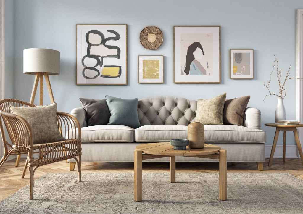
“For a light, soft scheme, use Athens on the main walls and Scandinavian Gray and Sheer Granite as accent colors for doors and feature walls,” Sarah Stephenson of Wattyl recommends. “For a bolder look go darker on the main walls and trim with the lighter color. Contrasting the light and dark in similar amounts will create a dramatic, dynamic space.”
Look 3: Contrast


“Working with similar undertones, these grays vary in shade, therefore create a subtle and soft color scheme,” Lucena-Orr suggests. “If you want to add a contrasting color, Western Myall will work with any of these softer grays.”
“Using Violet Verbena as a neutral in quarter strength lends it to a strong palette with contrast tones in grays like Ship Shape and Black Flame. This works well with oak timber contrasts and Crisp White trims,” Taubmans, ambassador for Shaynna Blaze, says.
Haymes’ Wendy Rennie points to Sense, Marble Mist, and Intrigue from the Haymes palette. “The perfect neutrals combination is gray, white, and black,” she says. “This combination gives the ideal contrast between light and mid-tone colors to accentuate the features of the space. The black acts as the focal point of the combination, adding statement and punch to the overall scheme.”
This article originally appeared on our sister site, Homes to Love.